
You’ve got a business name, maybe a domain and a burning urge to open a logo maker. Hold that thought. If you pick a logo before you know what your brand should feel like, you’ll end up redoing it, and every redo costs time, money or both.
The fix is a mood board: one page of images, colours, textures and type that shows the direction your brand is heading before you spend a cent on design. This guide walks you through building your first one with free tools only (Canva Free, Pinterest and Google Slides), then shows how that single page makes your logo, colour and font choices much easier. It works wherever you’re building, from Boston to Bristol, Auckland to Cape Town.
What a Brand Mood Board Actually Does
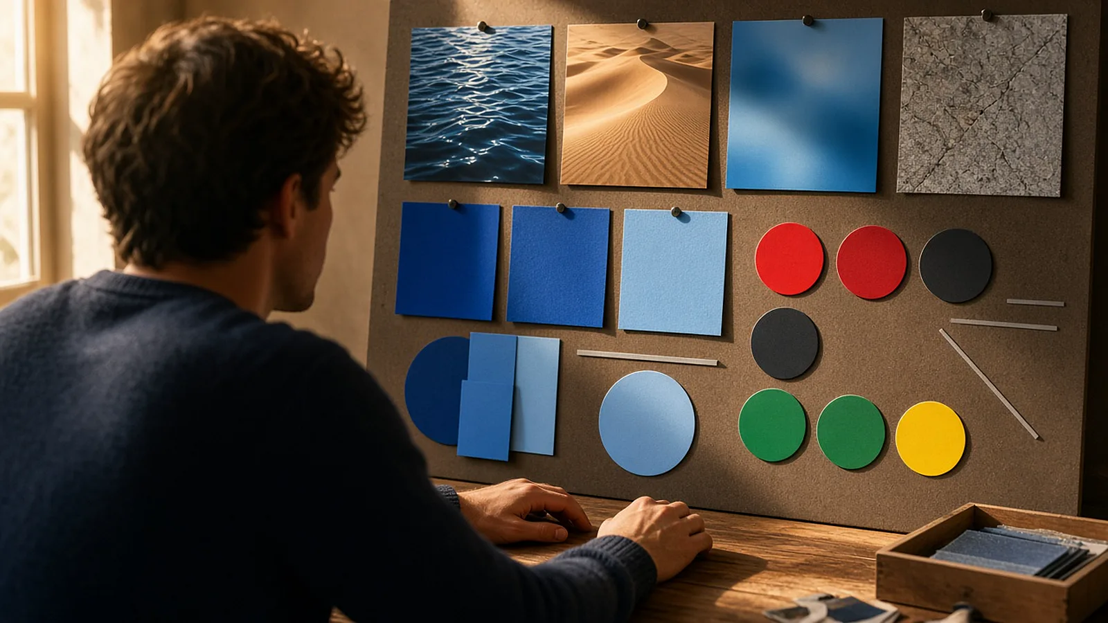
Canva describes a mood board as a collection of images, textures, typography, colour palettes and descriptive words that designers use to capture a mood that’s hard to explain in words alone1. That’s the whole job. It isn’t a logo, a website or a final design. It’s a direction.
For a new founder on a budget, that direction does three useful things:
- It stops random design decisions. Without a board, you choose a font because it looked nice at 11pm, a colour because it was the default and a logo icon because it was first in the list. With a board, every choice has to fit the page.
- It makes briefs cheaper. If you do hire a designer later, a clear board cuts down the back-and-forth. You’re not paying someone to guess what “modern but warm” means to you.
- It keeps you consistent. Your social posts, price list, packaging and website all point back to the same page, so your brand looks like one business instead of five.
The best part is that it costs nothing but an hour or two of focused attention. That’s discipline, not spend.
Before You Start: Three Words and One Customer
Don’t open any tool yet. Grab a notes app and answer two things.
First, pick three brand words. These are adjectives that describe how you want customers to feel, not what you sell. A few examples to get you thinking:
- A dog-walking service in Toronto, Canada: calm, trusted, outdoorsy.
- A bookkeeping side hustle in Dublin, Ireland: clear, steady, friendly.
- A beach-wedding stylist in Nassau, The Bahamas: bright, relaxed, romantic.
Avoid empty words like “professional” or “high quality”. Every business wants those. Pick words that would make a different business choose a different look.
Second, name one real customer. Not “everyone aged 18–65”. Think of a specific type of person: “a busy parent in Melbourne who books online at lunchtime”, or “a small café owner in Christchurch who needs invoices sorted by Friday”. You’ll test every image on your board against this person: would they find it appealing and trustworthy?
Write the three words and the customer at the top of your notes. They’re your filter for everything that follows.
Step 1: Collect Ideas on a Private Pinterest Board
Pinterest is the fastest free way to gather lots of visual ideas, and you don’t have to do it in public. Pinterest’s help centre explains that when you create a board you can toggle Keep this board secret, and that only you and anyone you invite can see a private board2. Perfect for messy early thinking.
Here’s the process:
- Create a new board and name it after your business, plus “mood”. Switch it to private.
- Search for your three words combined with visual terms: “calm outdoor photography”, “steady minimal interior”, “bright relaxed beach texture”. Avoid searching your competitors’ names. You want a feeling, not a copy.
- Save 30 to 50 pins quickly. Don’t overthink it. If something makes you pause, save it.
- Look beyond your industry. A bakery’s brand might borrow its mood from a ceramics studio, a garden or a vintage poster.
One important rule. Images on Pinterest belong to the people who made them. Your board is for inspiration and direction only. Pinterest’s own copyright page says that, where necessary, permission to use an image you find there should be sought from its copyright holder3. So never lift a pinned photo, illustration or logo and put it on your website, packaging or social posts. Use the board to describe the look, then create or license your own visuals.
Step 2: Edit Ruthlessly Down to 8–12 Images
Now comes the part most people skip, and it’s where the value is. A board with 50 images says nothing. A board with 10 strong ones says exactly what you mean.
Go through your pins with your three words and your customer in front of you. For each image, ask:
- Does it match at least two of my three words?
- Would my customer feel comfortable with a business that looks like this?
- Is it here because of its mood, or just because it’s pretty?
Delete anything that fails. Then look for patterns in what’s left. Are most images light or dark? Warm or cool? Busy or spacious? Do the photos feature natural textures (wood, linen, paper) or smooth, polished surfaces? Are the type samples rounded or sharp, classic or modern?
Write those patterns down in a single line, for example: “Light, warm, lots of white space, natural textures, rounded type.” That sentence is your brand direction in words. The board is that same direction in pictures.
Aim to finish with 8 to 12 images. If you’re stuck at 20, you probably have two moods fighting each other. Pick the one that suits your customer better and remove the other.
Step 3: Build the Board in Canva Free or Google Slides
Now put your shortlist onto one clean page. Either of these free tools works, so use the one you’re most comfortable with.
Option A: Canva Free
Canva has a dedicated mood board maker and free mood board templates you can customise1. Canva’s pricing page lists the Free plan at US$0, including the drag-and-drop editor, a large template library and one Brand Kit limited to three colours4. That three-colour limit is actually a useful constraint for a first brand.
- Search the templates for “mood board” and pick a simple grid layout. Ignore the template’s colours; you’ll replace them.
- Recreate your look using your own photos or Canva’s free elements that match your shortlist, rather than pasting other people’s Pinterest images into a design you’ll keep or share.
- Add a row of colour swatches (more on choosing them in the next section).
- Add two type samples: one for headings, one for body text.
- Add your three brand words in small text in a corner.
If you want to learn how to make free templates look less generic, our step-by-step guide to making free Canva templates look custom-designed covers exactly that, and pairs well with this board.
Option B: Google Slides
Google says anyone with a Google Account can create in Slides, with some advanced features reserved for paid Workspace plans5. For a mood board, you need none of those.
- Open a blank presentation and set a plain white or light-grey background.
- Insert a table or simple grid of image placeholders, and drop in your shortlisted visuals.
- Use Insert → Shape to add circles or squares for colour swatches.
- Type your heading and body font samples in text boxes.
Slides is also handy because you can share a view-only link with a friend, partner or future designer in seconds.
Whichever tool you use, keep the layout simple. Lots of space between images, one big “hero” image that captures the mood best, and everything else smaller around it.
Step 4: Pull Your Colour Palette From the Board
This is where your board starts paying for itself. Instead of choosing colours from thin air, you’re picking them from images you’ve already decided feel right.
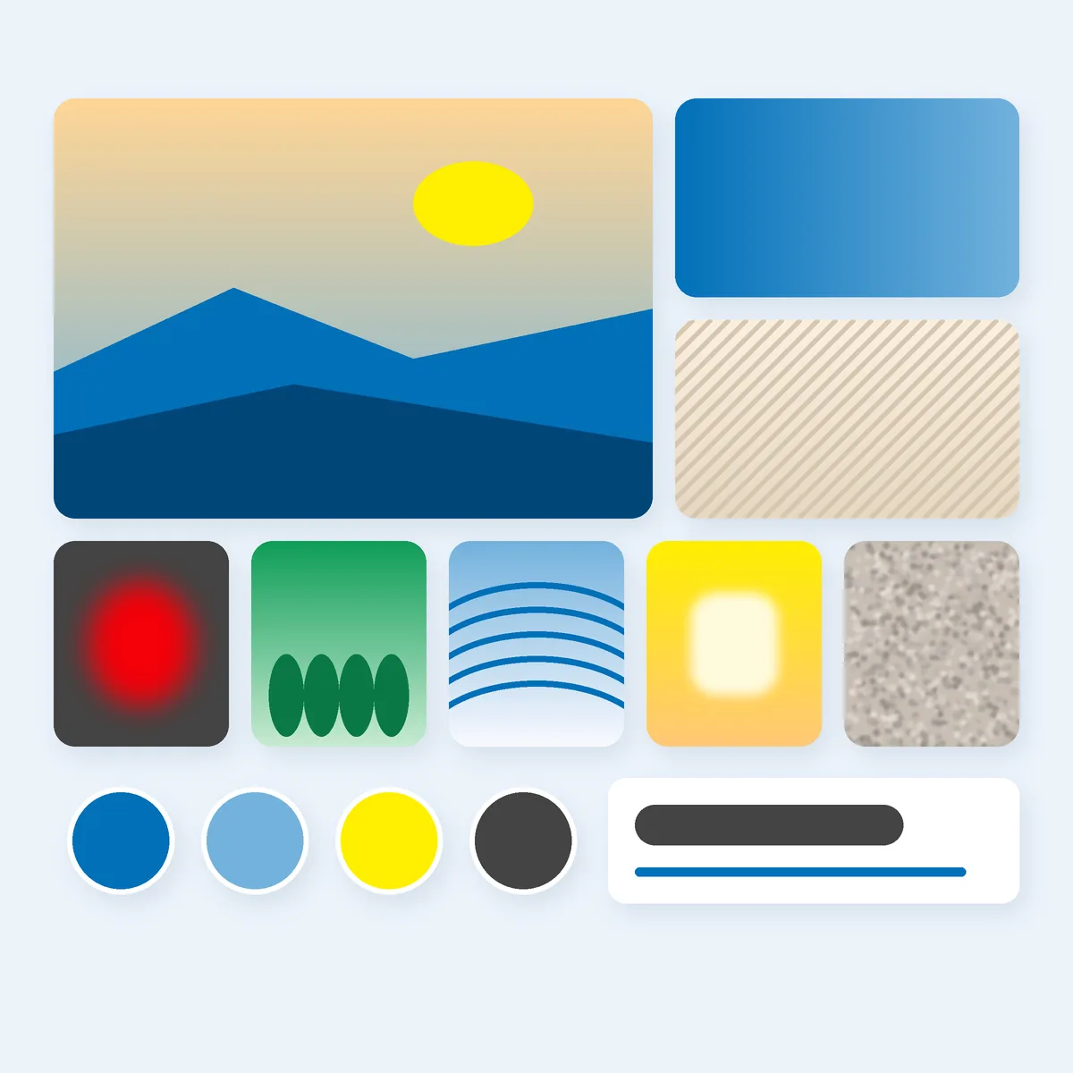
- Look at your hero image and two or three other key images. Which colours repeat?
- Use the colour picker in Canva or Slides to sample them. Write down the hex codes (for example #0170B9).
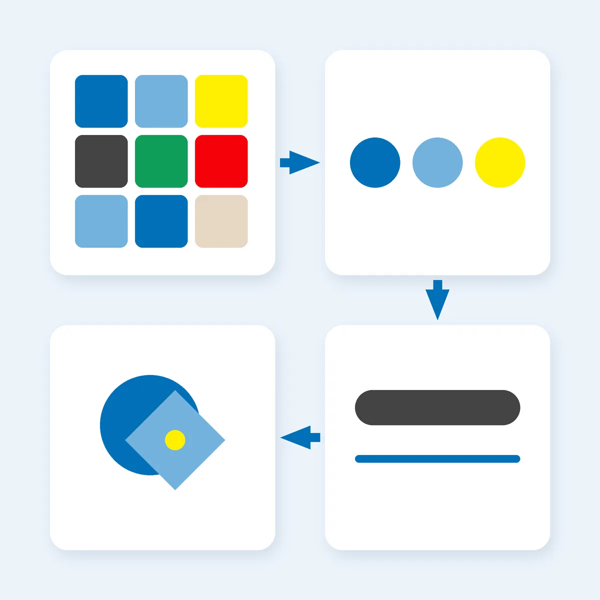
- Choose one main colour, one supporting colour and one accent. Our guide to the three-colour rule explains why three is plenty and how to balance them.
- Add a neutral (white, off-white, charcoal) for backgrounds and text. Neutrals don’t count towards your three.
Run one practical check before you commit. If your text colour is too close to your background colour, people will struggle to read it. The W3C’s accessibility guidelines set a minimum contrast ratio of 4.5:1 for normal-size body text (3:1 for large text)6. Free online contrast checkers will tell you the ratio for any two hex codes. If your favourite pairing fails, keep the colour but use it for shapes and backgrounds, not small text.
Step 5: Let the Board Choose Your Fonts and Shape Your Logo
Fonts
Look at the type samples and the overall mood. Rounded and friendly? Sharp and modern? Classic and elegant? Then pick two fonts at most: one for headings and one for body text.
Google Fonts is a good free source. Its FAQ says all Google Fonts are open source, free, and can be used commercially, including in logos7. Each font still has its own licence file, so it’s worth a quick look, but for most founders this removes the “can I actually use this?” worry.
A simple test: type your business name and one sentence of real copy (such as your opening hours or price list) in each candidate font. Put them next to your board. The one that looks like it belongs there wins.
Logo
Your board now gives you three of the four logo ingredients: colours, fonts and a mood. When you sit down to make the logo, every option you try must pass one question: does it look like it came from this board?
- If your board is calm and spacious, a busy icon with three gradients won’t fit.
- If your board is bold and energetic, a thin, pale wordmark will look timid.
- If your board is warm and handmade, a cold, geometric symbol will feel off.
Our walkthrough on creating a logo with free tools in under an hour takes you through the actual build. Do this mood board first, and that hour goes much further.
Same Board, Ten Markets
A mood board works the same way wherever you’re building, but your customer’s expectations aren’t identical everywhere. Before you lock in your direction, check it against where you sell. All of the tools in this guide are free on their basic plans, so the default cost is US$0 wherever you are4 5, though plan details can change, so check each tool’s pricing page.
- United States: you’re likely selling across many regions and customer types, so keep your one named customer front and centre and resist adding a mood for everyone.
- Canada: if you may need French-language versions of signs, packaging or social posts, test your fonts and layout with French text too. Longer words can break a tight design.
- United Kingdom and Ireland: if you’ll print price lists, cards or packaging, check your palette on paper as well as on screen. Printed colours can look different from your monitor.
- Australia and New Zealand: if your business runs outdoors or on mobile, view your board on a phone in bright daylight. Pale colours that look elegant indoors can disappear in the sun.
- Cayman Islands, The Bahamas and British Virgin Islands: if you serve visitors as well as locals, make sure your board feels welcoming to both, not like a generic holiday brochure.
- South Africa: if you sell across several language groups, choose fonts with good character support so names and phrases display properly.
These are prompts to think about your customer, not rules. Your real customer, the one you wrote down at the start, beats any general advice.
Your Move
Block out one focused hour this week. Write your three brand words and your one customer. Fill a private Pinterest board, cut it down to 8 to 12 images, and build a single page in Canva Free or Google Slides. Then use it to pick three colours, two fonts and the direction for your logo.
Pin the finished board where you’ll see it every time you make something for your business. When you’re unsure about a design choice, the answer is simple: does it fit the board?
We’re helping 1,000 ambitious people turn their side hustles into main hustles by 2028, and a clear brand direction is one of the cheapest, smartest first moves you can make. You’ve got this.
Ready to build the rest of your brand? Grow Your Hustle →
Where the numbers come from
Free-plan details were read from each vendor’s own pages in October 2026 and can change at any time.
- Canva. Free Mood Board Creator (product page; read 25 October 2026). canva.com
- Pinterest. Private boards (help centre; read 25 October 2026). help.pinterest.com
- Pinterest. Copyright (help centre; read 25 October 2026). help.pinterest.com
- Canva. Plans and pricing (vendor pricing page; read 25 October 2026). canva.com
- Google Workspace. Google Slides product page, FAQ “How much does Google Slides cost?” (read 25 October 2026). workspace.google.com
- W3C. Understanding Success Criterion 1.4.3: Contrast (Minimum), WCAG 2.1 (read 25 October 2026). w3.org
- Google Fonts. Frequently Asked Questions (read 25 October 2026). developers.google.com
